Breaking News
Trump’s Oval Office ‘session’ on the economy? Charts about Biden.
President Donald Trump had just named a new nominee to the board of the Federal Reserve and imposed hundreds of billions of dollars in new import taxes when he quickly summoned the White House press pool Thursday for what was described as an urgent economic announcement.
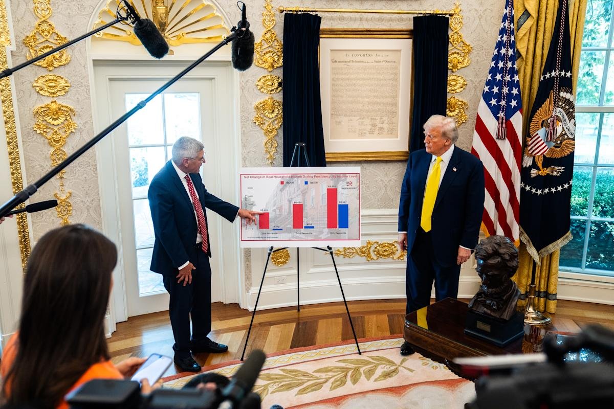
But in the Oval Office, the president stood with an easel, poster-sized charts and longtime conservative economist Stephen Moore, an informal Trump adviser.
Subscribe to The Post Most newsletter for the most important and interesting stories from The Washington Post.
“We’re going to have a quick session with Steve Moore,” Trump said, then yielded the floor.
What followed was an eight-minute pep rally on Trump’s economy vs. that of his predecessor, Joe Biden.
The urgent economic news, the president said, was “these numbers that were just released. I mean, literally just released.”
Moore and his team at the Committee to Unleash Prosperity, a nonpartisan advocacy group for conservative economic ideas, had devised a new model to use Census Bureau monthly data surveys to predict future releases of national income data with a 3 percent error rate, Moore told The Washington Post.
“This is going to be a big deal for us because no one else has just figured out how to do this,” he said in an interview.
Moore said he meets with Trump every few months or so – “I don’t see him unless there’s something, you know, that is important to tell him” – and felt the numbers warranted the president’s attention.
“I saw the data, and I knew he would like it. It’s very positive for Trump,” Moore said. “ … I thought this was pretty important. He likes data, especially if it’s good news.”
Trump was so pleased, he asked his staff to usher in the press to see the numbers, Moore said.
A senior White House official, speaking on the condition of anonymity to discuss scheduling, confirmed that Moore had a meeting with the president and brought the charts – and that Trump, after seeing them, was delighted and wanted to show off his success.
The charts, five of them, indicated that they showed revisions of Bureau of Labor Statistics jobs data, median household income and net change in household income. The Post was unable to immediately verify the data. The White House and Moore did not immediately share the charts or the underlying figures used to produce them.
But in each, the posters showed soaring red lines or bars (denoting Trump’s term) and diminutive blue ones (showing Biden’s). The message, Moore said, was clear: “You can see every income group did better under Trump than Biden by a wide margin.”
Story Continues